

Playing cards / Visual system / Packaging
Wistaria Playing Cards
A self-initiated playing-card system, drawn in Adobe Illustrator and made physical. Geometry, negative space, and two constrained palettes connect individual cards to a shared visual language, carried through to the printed deck and its packaging.
01 / The geometric idea
One emblem, four suits.
The starting point was a mark that sits between a star and a flower. Cutting and recoloring that shared geometry produced the four ace treatments, giving the suits a common origin without making them identical. The star returns in the jokers and packaging.
Wistaria takes its name from that flower-like structure. The deck does not literally illustrate wisteria; the connection is through form, repetition, and a sense of nature within the geometry.
02 / Suit studies
A family of forms.
Four suits, each built from the same visual vocabulary. Select a study to see how number-card structure gives way to denser court compositions. Explore the number cards, courts, and aces together.
Diamonds study selected.
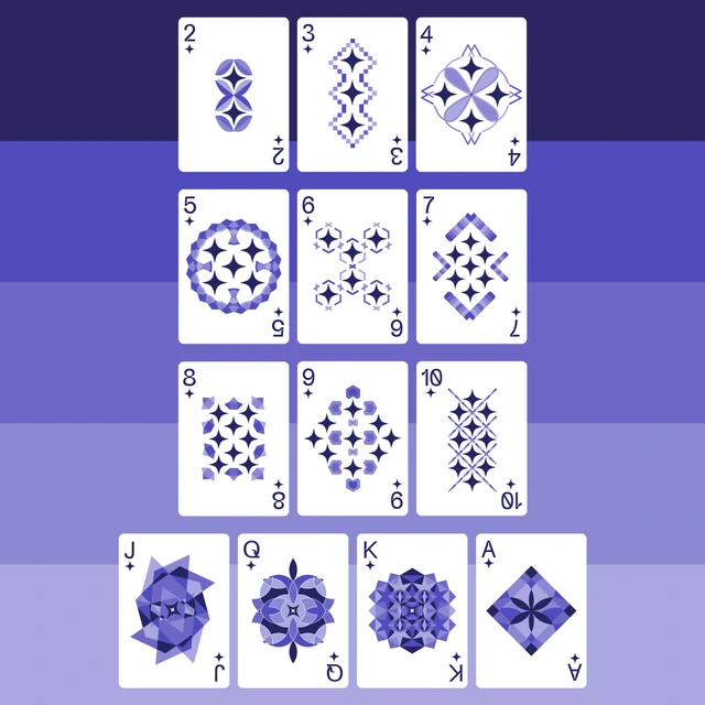
Purple geometry follows the diamond pips, opening into layered court cards and a cut-and-recolored ace.
03 / The complete system
Designed around the space between.
I began each number card with its pips, then worked into the empty space around them. That constraint set the rhythm of the composition: where forms could overlap, where repetition could build, and where the card needed to stay open.
The darkest tone carries the indices and suits. Supporting shades give the number cards structure, while the court cards use all five tones in denser arrangements. Each card has its own composition, but the rules remain shared.
04 / Vector construction
Overlap. Subtract. Repeat.
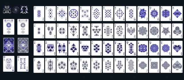
Every card was drawn in Adobe Illustrator. Shape Builder and Pathfinder let me overlap vector geometry, subtract sections, and find new forms within existing ones. Repetition and symmetry gave those constructions a structure; refinement kept the individual compositions connected.
I did not begin every card with a fixed final shape. The process was exploratory, working with the established palette and pip layout rather than adding detail for its own sake.
05 / Color constraint
Two palettes. Ten colors.
Hearts and diamonds share one five-color family; spades and clubs share another. Working within ten colors created contrast through tonal relationships and arrangement. The constraint left room for individual compositions while keeping the four suits connected.
Palette samples from the final artwork.
06 / Packaging
From flat artwork to a folded box.
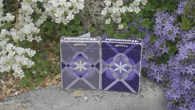
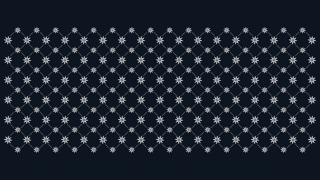
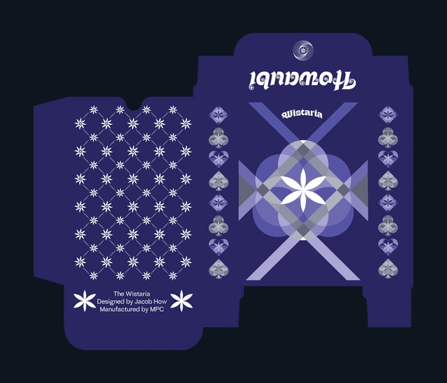
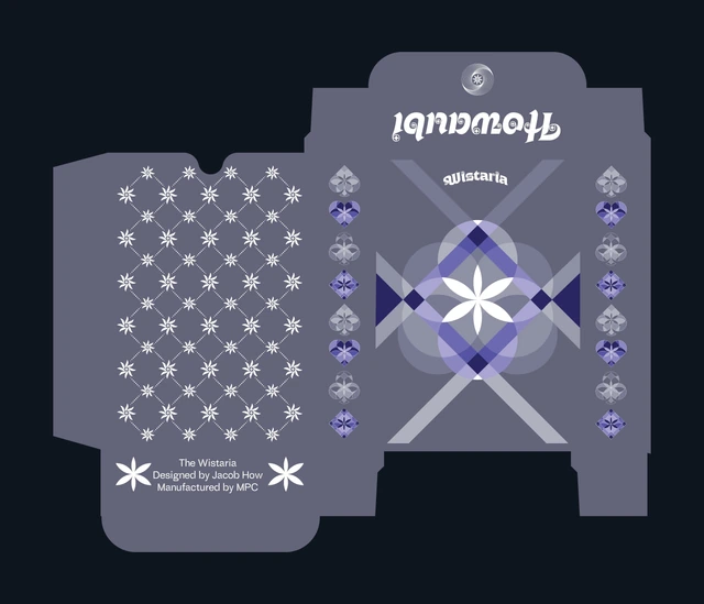
Preparing packaging meant learning to compose across a folded form. The flower emblem anchors the front, ace designs repeat along the side panels, and the motif continues across the remaining artwork.
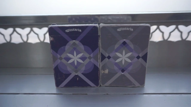
The layouts were designed with visual alignment in mind when two boxes sit beside one another. The purple and grey treatments carry the same structure into two editions. Shown here are the flat tuck-box artworks and the physical printed boxes.
07 / The physical deck
Printed in two editions.
The project resulted in 16 complete printed prototype decks: eight purple and eight grey, all on M31 linen stock. The editions are visually distinct but structurally alike, carrying the vector system into cards that can be held and handled.
The film presents the printed boxes, card surfaces, and deck in hand, bringing the patterns back to the scale of a physical object.
08 / Reflection
A system, made tangible.
Wistaria brought card design and packaging into one physical object. Repetition and limited palettes made the work more focused, not less individual. The challenge was to keep refining each composition while protecting the relationships across the deck. Seeing those relationships survive the move from vectors to printed surfaces was the clearest outcome.
