01
Gosh
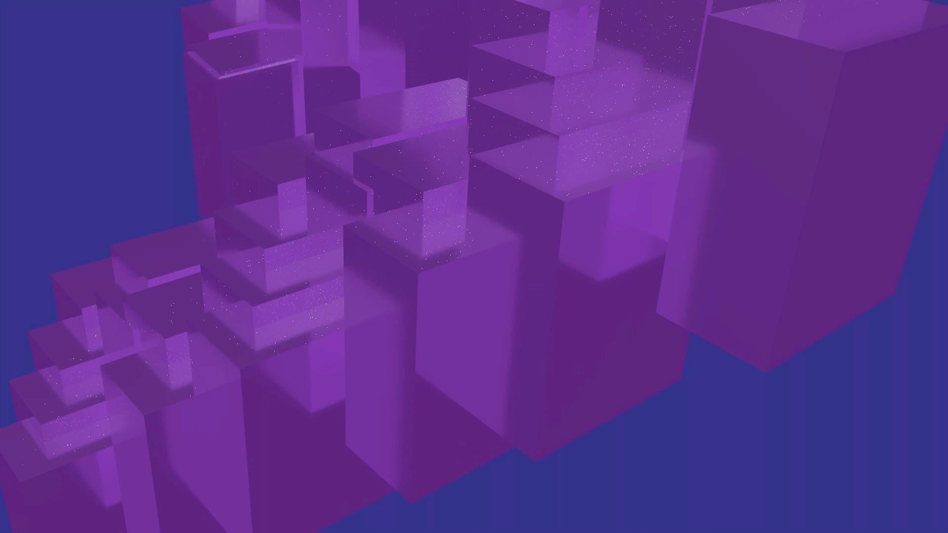
Slow reveals, tension, and architectural mass.


Visual album / Motion system / 3D animation
A full-length visual album rework of Jamie xx’s debut album, exploring color, rhythm, and form through sound-reactive 3D animation. Created as a self-directed study in Cinema 4D, motion design, and audiovisual storytelling.
My visual system
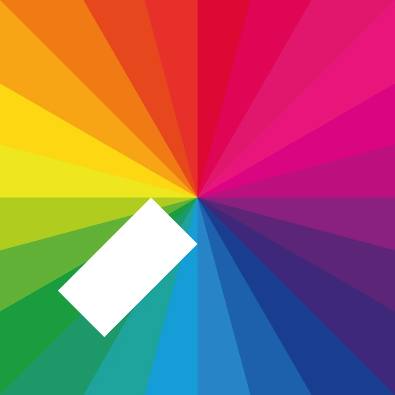
The source album / 2015
In Colour is Jamie xx’s 2015 debut solo album, moving between club-driven rhythm, sampled voices, bright melodic passages, and quieter atmospheric moments.
My visual rework interprets the complete 11-track album as a connected audiovisual system. Each song has its own motion language, while color, geometry, repetition, and rhythm connect the album as a whole.
Explore the original album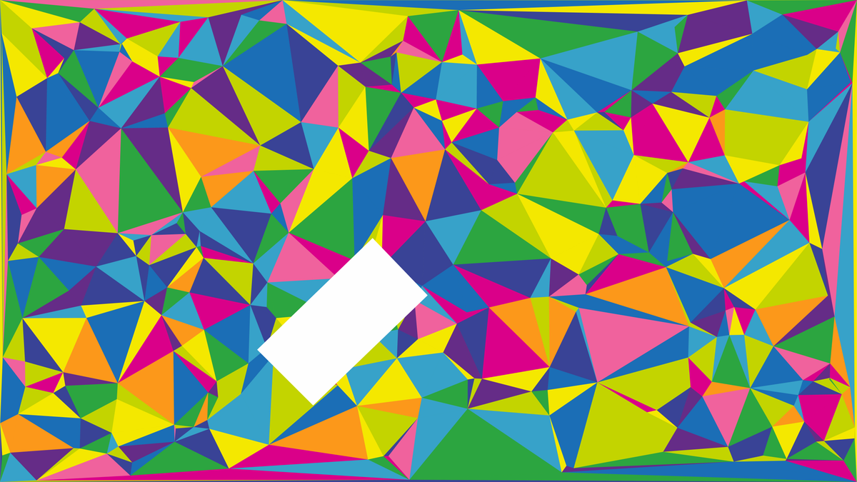
Project overview
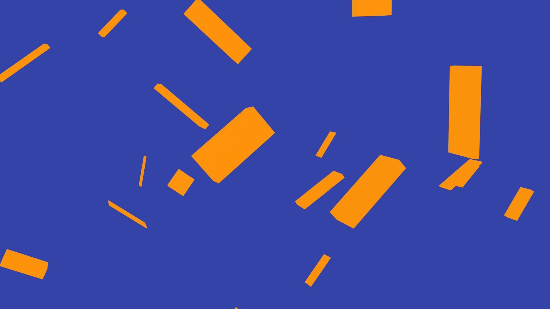
Built entirely in Cinema 4D, the project explores how sound can drive structure rather than decoration. I focused on minimal, graphic forms (primarily rectangles and angular geometry), allowing subtle changes in scale, rotation, fragmentation, and color to carry the narrative of each song.
The visuals respond directly to stems and dynamics in the music, creating moments that feel synchronized without becoming literal or overly illustrative. What began as an audio-reactive study evolved into a complete visual language shaped by the restraint, clarity, and emotional precision of In Colour.
Challenge
In Colour is defined by texture, restraint, and emotional pacing. The challenge was to sustain a cohesive album-length visual experience, finding a balance between structure and feeling without becoming too literal or too chaotic.
The goal was not to redesign the album, but to listen closely and build visuals that could quietly live alongside the music.
Process
Every track began away from the software. Repeated listening sessions established the energy, pacing, and structural cues that the motion needed to carry.
I mapped energy changes, structural shifts, and emotional cues before opening Cinema 4D, using those observations to decide how motion should behave over time.
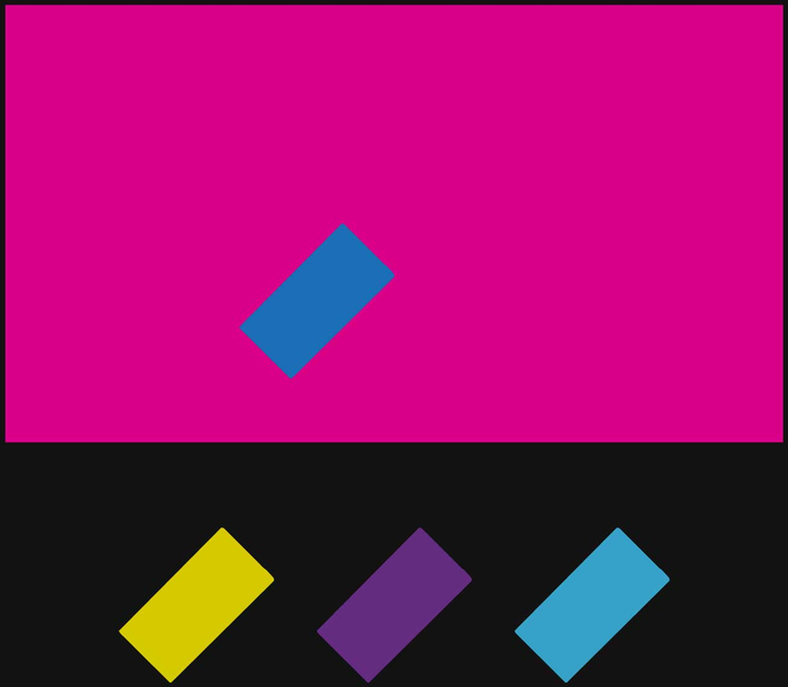
A small set of recurring forms (rectangles, planes, and triangles) kept the work restrained. Variation came from motion, scale, timing, and color instead of novelty.
Each track became a focused experiment with its own palette, motion logic, and geometric behavior while still referencing the chapters around it.
Rather than drawing waveforms or spectra, I translated sound into parameters such as scale, rotation, visibility, and timing so the motion could feel musical without becoming illustrative.
Each animation uses a constrained palette of up to five colours. One colour carries forward into the next track, creating continuity across all eleven visual identities and connecting the album as one visual system.

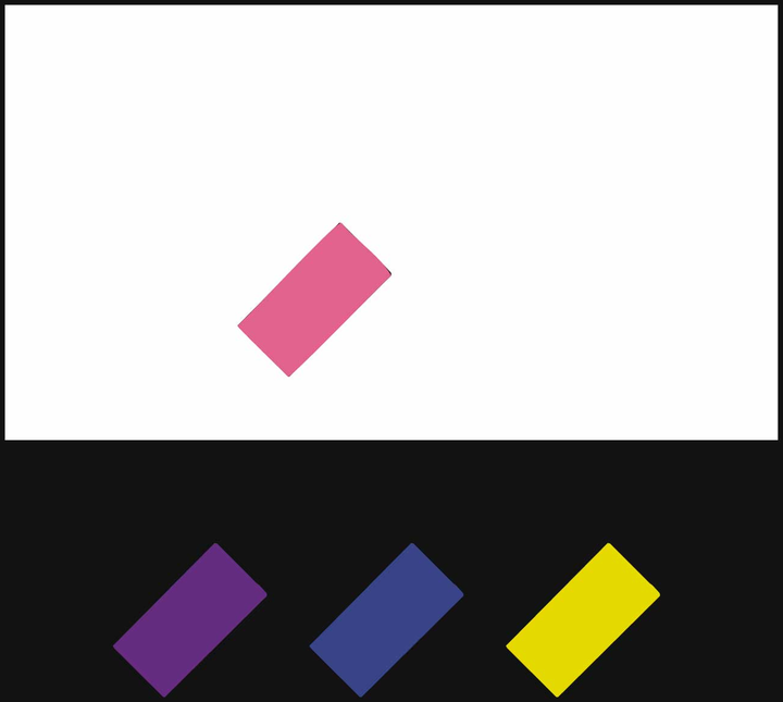
Track studies
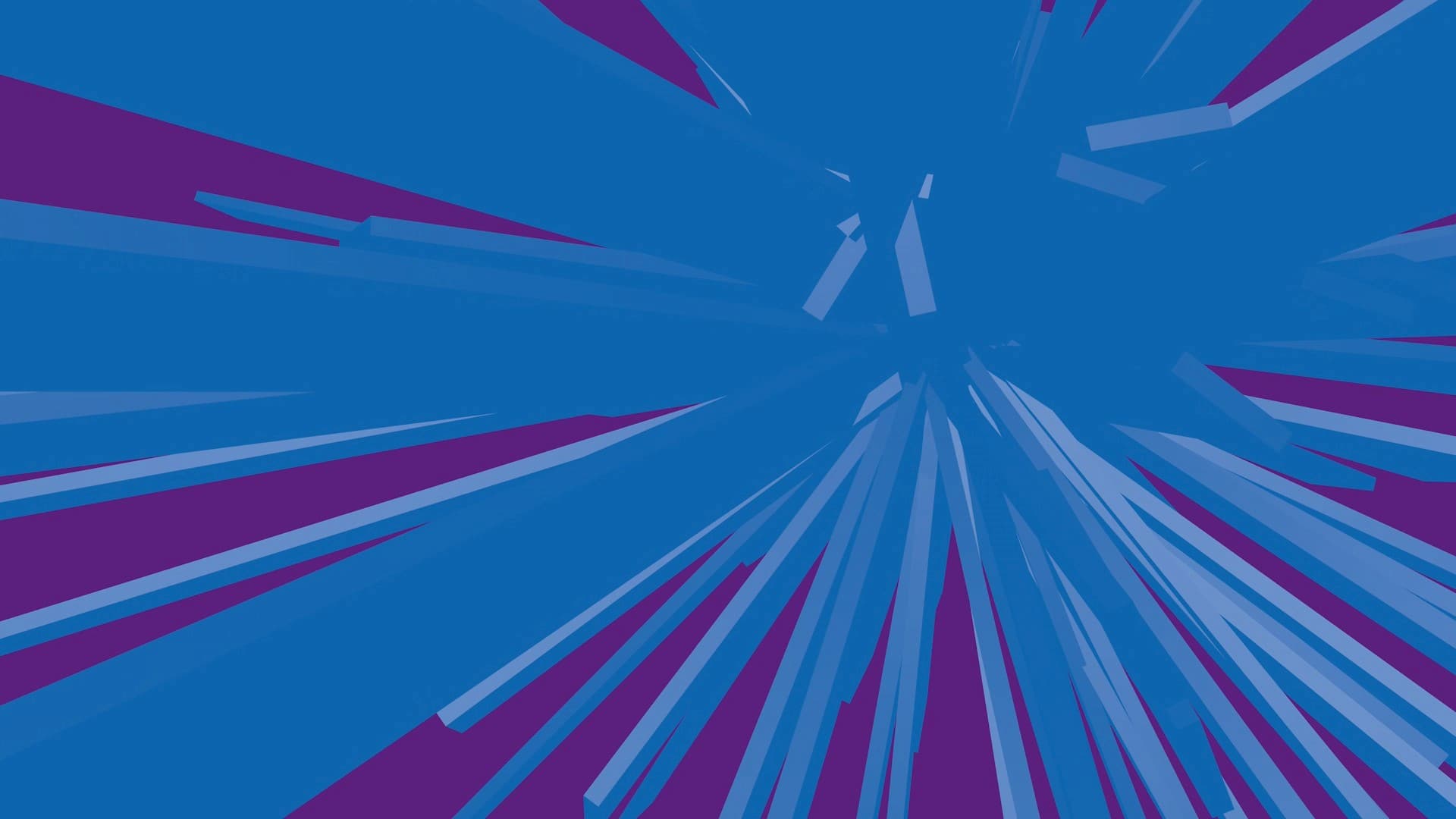
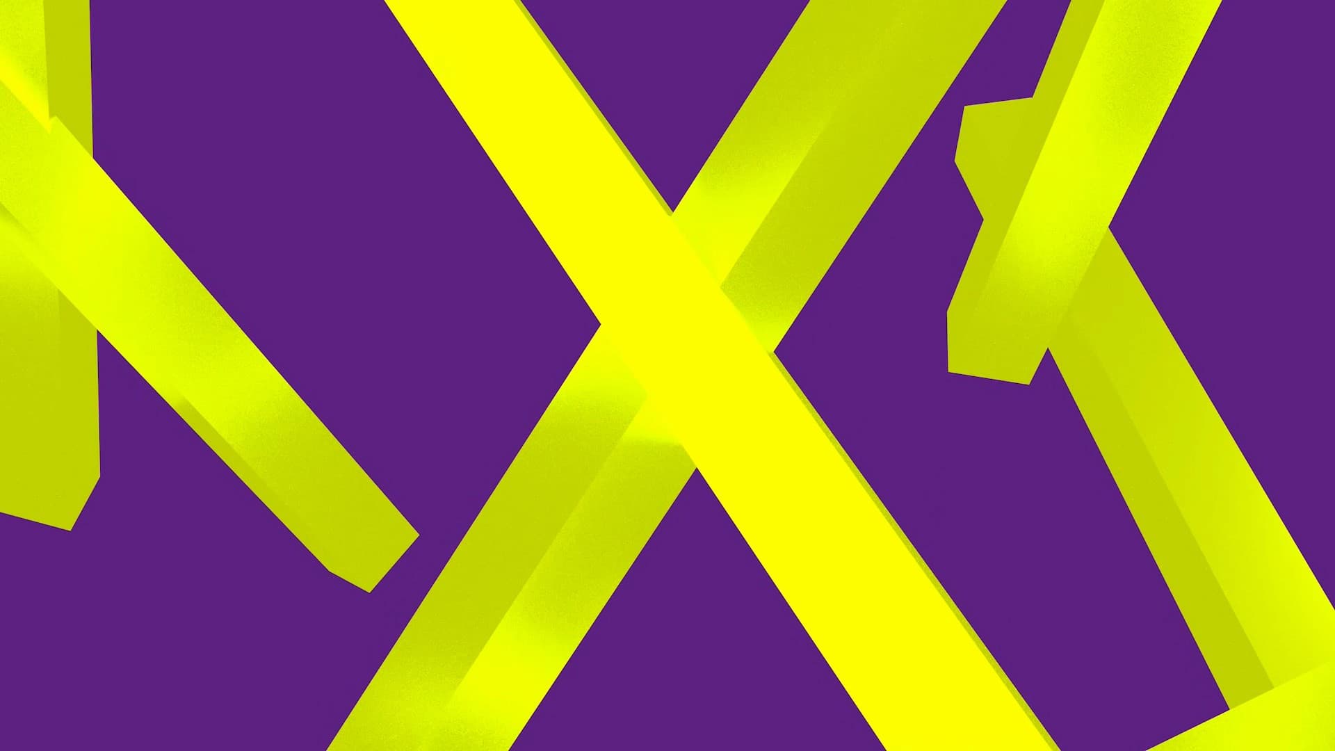
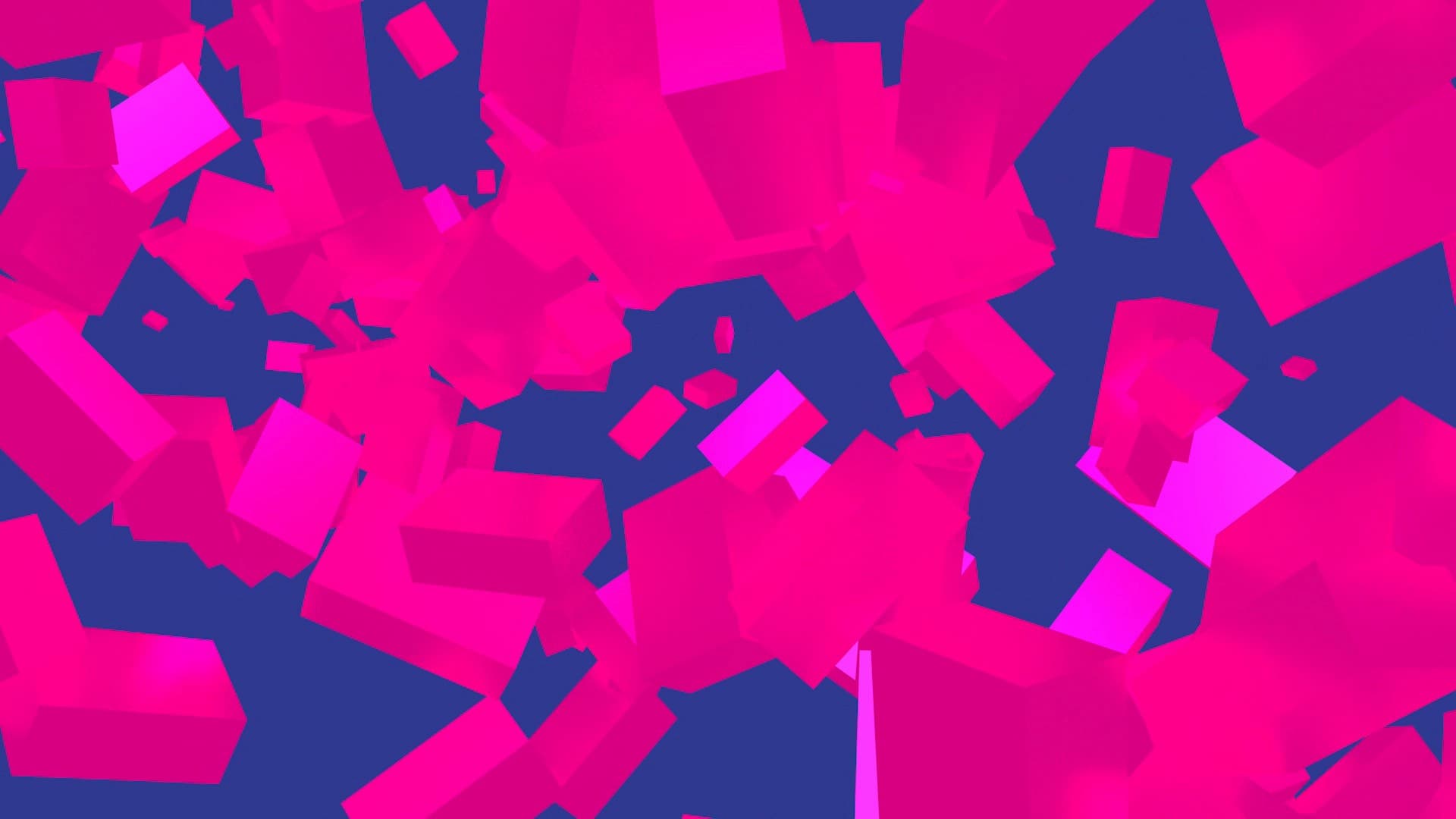
The complete album sequence shows how shared geometry changes character through pacing, camera behavior, fragmentation, color, and negative space.
Slow reveals, tension, and architectural mass.
Fluid movement shaped by the track’s internal rhythm.
Balance, offset motion, and shifts in perspective.
Fragmentation and reassembly as a repeating motion system.
Minimal, percussive movement with tightly constrained forms.
Disappearance, isolation, and negative space.
Cinema 4D workflow
I taught myself Cinema 4D through the project by building, breaking, and rebuilding scenes. The core toolkit included MoGraph Cloners, Effectors, Fields, Fracture, camera animation, and material workflows.
Many scenes were rebuilt as my understanding improved. That long-form repetition moved the work from simple MoGraph setups toward more controlled systems for fracture, camera movement, materials, and audio-reactive motion.
Results
The finished 42-minute visual album gives every track a distinct but connected chapter. Constrained palettes, motion logic, and recurring geometry evolve rather than repeat across the runtime.
Although the work was produced song by song, shapes, camera behavior, and pacing subtly refer back to earlier tracks. The project also records a clear progression from simple MoGraph studies to more deliberate control of fracture, fields, camera animation, materials, and audio-reactive motion.
Reflection
This visual album became more than a personal tribute to In Colour. It became a record of learning. Committing to a long-form project made it possible to move past surface-level experimentation and develop a deeper understanding of motion systems, pacing, and restraint in 3D design.
It reflects how I approach design more broadly: listening first, limiting tools intentionally, and building systems that prioritize clarity and feeling over spectacle. The project marked my transition from static design into motion and 3D, and it continues to shape how I think about interaction, rhythm, and visual storytelling.
