

Experience Studio / Spring 2025
Purdue OUR
Guiding students into undergraduate research
Purdue’s Office of Undergraduate Research offered a broad ecosystem of opportunities, funding and support. The challenge was knowing where to begin. Our nine-person team translated its research pathway into a guided website prototype, giving students direct routes when they knew their goal and a structured starting point when they did not.
01 / The starting point
A pathway on paper. A fragmented journey online.
The OUR marketing team supplied a printed pathway connecting interests, opportunities, mentors, applications, research and presentation. We were not inventing a new research process. Our task was to make an existing process easier to find and follow through the website.
Online, information was distributed across navigation menus, external resources and documents. Students could encounter opportunities without understanding the next action, or miss the resource that explained it. The redesign needed to clarify these connections while respecting OURConnect as a separate discovery portal.
Source pathway / Documentation p. 9
The process already existed.
Define interests, browse resources, identify mentors, meet, apply, conduct research and present. The printed pathway connects these stages; the web experience needed to make those connections usable.
Existing OUR website / Documentation p. 38
A collection of resources, not a clear next step.
The preserved homepage mixes events, service requests and institutional navigation. Research examined how students found their way through this existing information, not whether more opportunities should be invented.
02 / Research
Different students. Different starting points.
Our team interviewed undergraduates about finding research and graduates about their previous experiences. Students valued the range of topics available, but described fragmented information and a preference for concise navigation. Comparative analysis of university research sites separately informed task-based entry points, categorized resources and staged guidance.
Current-site testing made the central tension clearer. Some students arrived looking for a specific opportunity or funding source. Others, especially freshmen and those with little research experience, needed the process explained. One generic Get Started entry did not adequately serve those different intentions. OURConnect’s purpose and placement were also difficult to recognize.
- 14
Initial interviews
11 undergraduates + 3 graduates
Research discovery, experiences with OUR resources and the search for mentors or information.
- 10
Current-site participants
Undergraduates with varied research experience
Pathway-related tasks on the existing website, with participants verbalizing expectations and thought process.
- 6
Concept-feedback participants
5 novice undergraduates + 1 experienced graduate
Qualitative feedback on sketches, starting actions, content hierarchy and proposed layouts.
- 5
Low-fi participants
Undergraduates with little or no research experience
Interactive prototype tasks, suggestions and comparison with the existing OUR experience.
These are separate activities, not a combined count of unique participants. Participation may overlap.
Mid-fidelity testing is documented without a participant count or composition. Sponsor reviews are separate from student research. Faculty interaction research was outside the principal scope.
03 / The pathway decision
Four ways in, with guidance when needed.
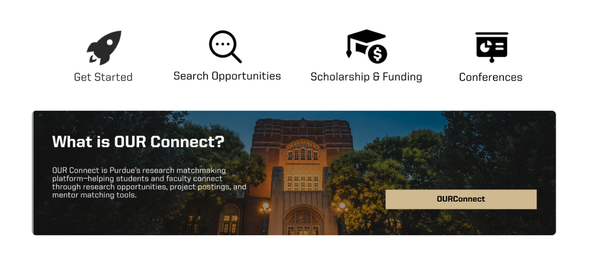
We reorganized the Home around four prominent actions: Get Started, Search Opportunities, Scholarships & Funding, and Conferences. Each gives a recognizable purpose to the next page. OURConnect gains an explanation at the point of discovery instead of remaining an unexplained destination.
This was not a choice between a rigid sequence and an unstructured collection of links. The proposal combined direct access with an available guide. Early flow branches and concept feedback helped establish that structure; prototype evaluation then tested what the entry points still failed to explain.
Source image loads here as you approach this study.
Existing experience
The resources existed. The route was unclear.
The existing homepage placed events, services and institutional navigation together. Current-site testing showed that students did not all approach this resource collection with the same goal.
- A comprehensive research process already existed
- Discovery crossed menus, links and documents
- One generic start could not address every intention
Evidence ready to load.
Team concept + feedback / Documentation p. 24
Clear actions, competing hierarchy.
Annotations on the team’s concept identify understandable main actions while questioning whether news and events compete with them. The feedback connects page hierarchy to the task of getting started.
Team prototype / Get Started detail / Documentation p. 39
Keep a guide alongside direct routes.
The final guide explains four research steps alongside the direct entry points. Low-fi participants’ requests for step-by-step help reinforced the importance of making this guidance explicit.
04 / What changed
The details that changed the direction.
Low-fidelity evaluation showed that flexible starts were not enough. Newcomers still wanted a step-by-step explanation, and help located only in the navigation could be overlooked. We strengthened the guided route while retaining the direct entry points. Numbered steps, supporting resources and a newcomer question made the guide more explicit without forcing everyone through it.
The conference page revealed a different assumption. Sponsor feedback pointed out that some visitors want to attend a conference, not present. The team added an attendee-date banner and refined the calendar to show relevant months together. Information, applications, judging and guidelines remained separate, so attendance was no longer treated as the same task as submitting work.
Existing OUR website / Documentation p. 44
Information across text and links.
The preserved conference page presents dates, event categories and reference links in a long text-led sequence. This is historical reference content, not current event information.
Team prototype / Documentation p. 44
Attendee guidance and visible deadlines.
The proposed banner surfaces attendance information above three calendar months. Sponsor feedback and the documented refinement explain this change; no task-time improvement is claimed.
05 / Final prototype
Follow a student goal.
The final interface carries the pathway through repeated entry actions, contextual sidebars, funding categories and clearly grouped information. Purdue’s wordmarks, photography and black, gold and white identity were existing constraints. Our contribution was the organization of the interface, not a new institutional brand.
Explore three representative goals below. These are selected final design states, with labeled details and optional whole-page context. The explorer explains the proposed structure; it does not run a search, process applications or reproduce every hotspot in the original Figma prototype.
Source image loads here as you approach this study.
Start researching
Choose a purposeful starting point.
Four prominent actions organize the Home around research intentions. The OURConnect explanation below gives the existing discovery portal a purpose before asking someone to leave the site.
- Get Started: guided research steps
- Search Opportunities: explore the available programs
- Scholarships & Funding: understand support options
- Conferences: find presentation and attendance information
Evidence ready to load.
06 / A bounded result
What testing established.
All five participants in the low-fidelity evaluation reported that the prototype was easier to navigate and use than the existing OUR website. Some still requested more detailed information. That combination mattered: the proposed navigation helped, but the content needed to do more work for newcomers.
This was a qualitative result from one prototype stage, not a measured reduction in completion time or errors. Later mid-fidelity testing informed further content and calendar refinement, but its participant count is not documented. Neither stage establishes production adoption or validated accessibility.
07 / Delivery
A proposed experience, documented for discussion.
We delivered a guided user flow, a high-fidelity interactive prototype and design documentation. Annotated static mockups recorded interaction decisions within the guided-flow deliverable. Together, these artifacts made the proposed structure available for review and further development.
Development-ready code and assets were explicitly outside the documented deliverables. The result shown here is design and prototype work, not a launched Purdue website or a production implementation.
Explore the original prototype.
08 / My contribution
Interface, prototype and sponsor conversations.
My contribution centered on interface design, prototyping and sponsor communication. I worked on Search Opportunities, Scholarships & Grants and Advisors & Ambassadors, and helped develop layouts for several pages. I also organized a review with JJ Sadler, preparing an agenda and questions for sponsor feedback.
These contributions sat within a nine-person team. Interviews, analysis, flow development, testing and overall delivery are credited collectively. The final report does not itemize ownership of every screen, and the earlier Advisors & Ambassadors work is not presented as sole ownership of the final OUR Staff page.
09 / Reflection
Guidance does not have to mean one route.
The strongest lesson was to separate guidance from forced sequence. A student who knows what they need should be able to go there directly. A newcomer should be able to understand both the next action and the process around it. Our work brought those needs into one structure, then used feedback to clarify where the structure alone was not enough.
Design team
Nine designers, one collaborative project.
Experience Studio, Spring 2025. Academic project with Purdue Office of Undergraduate Research.
- Maddie Nikolai
- Natalie Lam
- Simon An
- Avery Dellinger
- Hannah Ahn
- Alyssa Vo
- Terri Xie
- Emma Osante
- Jacob Howard
