

JM&A Group / Summer 2026
Automotive
Trends Report
During my summer internship at JM&A Group, I helped refresh the visual direction of the Q2 2026 Automotive Trends Report. The opportunity was to make the campaign feel more editorial and data-driven while working within an established brand system.

01 / Context
A clearer picture
of performance.
The Automotive Trends Report turns dealership performance data into a quarterly resource for the industry. Drawing on data from more than 1,700 dealerships, it brings together sales, financing and operational trends. Its campaign needed to make that information feel relevant before a reader reached the first chart.
As a Graphic Design Intern on JM&A’s marketing team, my contribution focused on the visual direction across web, social, CTA and data visualization assets. I explored cooler tones, cleaner hierarchy and recurring graphic elements that could connect the report to its promotion. Research, analysis, editorial content and website development belonged to the wider team. The design task was to give that work a coherent, recognizable presentation across formats.
I designed the opening graphic to make the report’s relevance clear when someone first encounters it in a shared link. Connecting dealership imagery with performance data introduces what the resource offers: a wider view of the business dealers work in every day. The goal was to give them a reason to explore the report and recognize JM&A as the source of that insight.
02 / Working within the brand
A refresh had to feel new without feeling unfamiliar.
JM&A already had a defined identity spanning logo use, color, typography and imagery. I treated those rules as a foundation, looking for room to evolve the composition and give ATR a more editorial presence. Recognition came from the established brand; the refresh came from how the pieces worked together.
- Pine
- Primary text hierarchy
- Arctic
- Highlights and emphasis
- Warm accents
- Selective emphasis
- Proxima Nova
- Established brand type
- Data graphics
- Content as imagery
I used JM&A’s established typography and color hierarchy to help readers recognize the source and find the main message quickly. That consistency matters when the same report appears in a social feed, a shared link or a resource page: each encounter should reinforce the connection between JM&A and the information it provides.
Working within the logo and clear-space rules kept the refresh connected to JM&A’s identity. Those shared rules also gave the campaign a repeatable foundation, so the marketing team could adapt the message across formats while presenting one recognizable report.
Brand principles: JM&A’s public guidelines (opens in a new tab)
03 / The visual language

Lead with
the insight.
The report thumbnail needed to communicate its value before someone opened it. I made data the focus to signal that readers would find sales performance analysis and industry context. This supports JM&A’s positioning as a knowledgeable partner to dealerships and gives the marketing team a recognizable image for promoting that expertise.
04 / From report to campaign
One report.
Three reasons to read.
A dealer might be interested in comparing performance, understanding market changes or finding a useful resource for their team. I gave each social graphic a different reason to open the report while keeping the campaign recognizable. This gave JM&A several ways to introduce the same research and connect it to different reader needs.

Put performance in context.
This graphic leads with the value of comparison. Dealers see their own results every day; nationwide data gives them a broader context for interpreting those results. I designed the message to make that benefit immediate, giving readers a practical reason to explore the report and positioning JM&A as a source of perspective beyond an individual dealership.
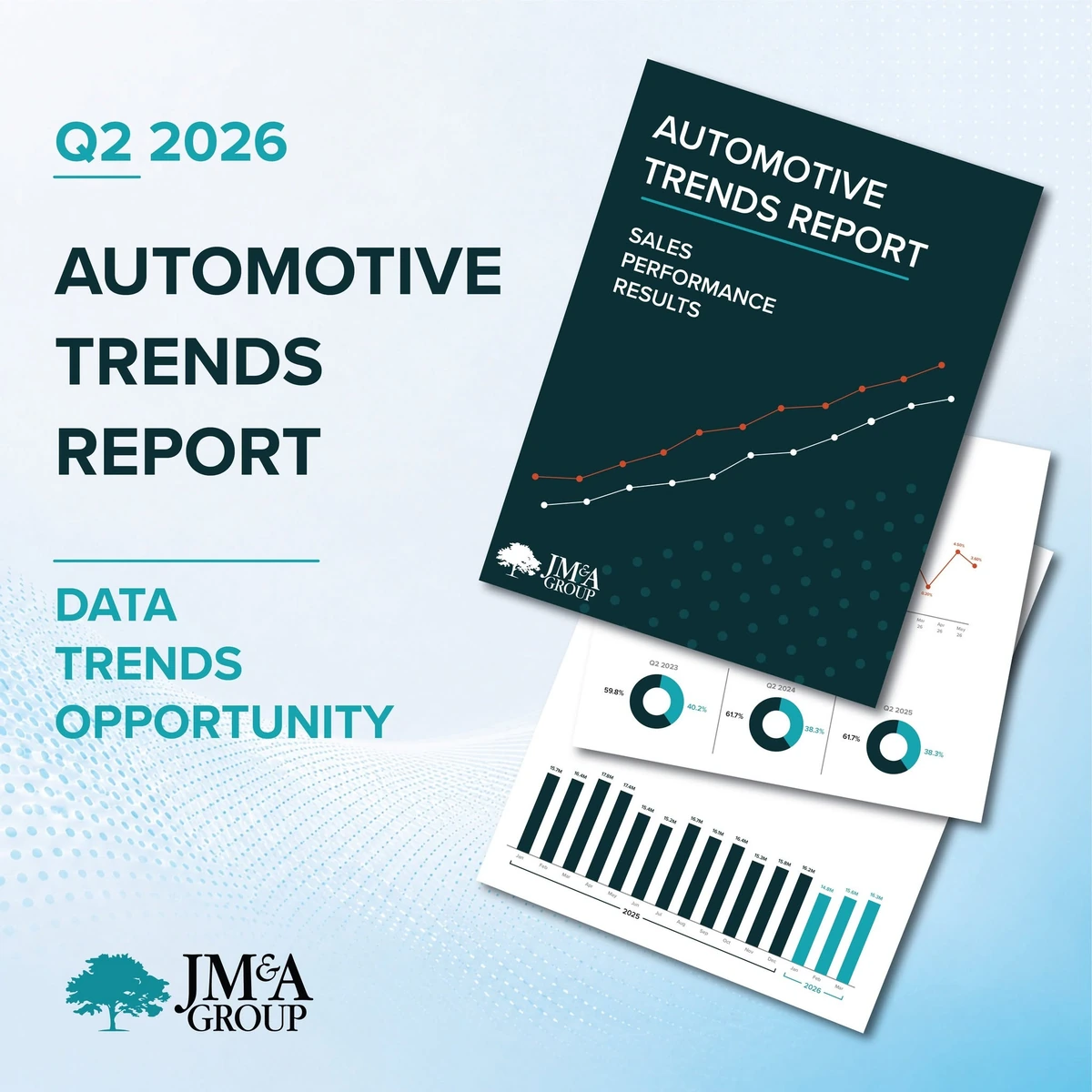
Make the value clear.
I designed this graphic to show dealers what they would gain by downloading the report. Previewing the research inside makes the offer more concrete and helps readers decide whether it is useful to them. For JM&A, the purpose is to turn interest in an industry topic into a reason to engage with its expertise through the full report.
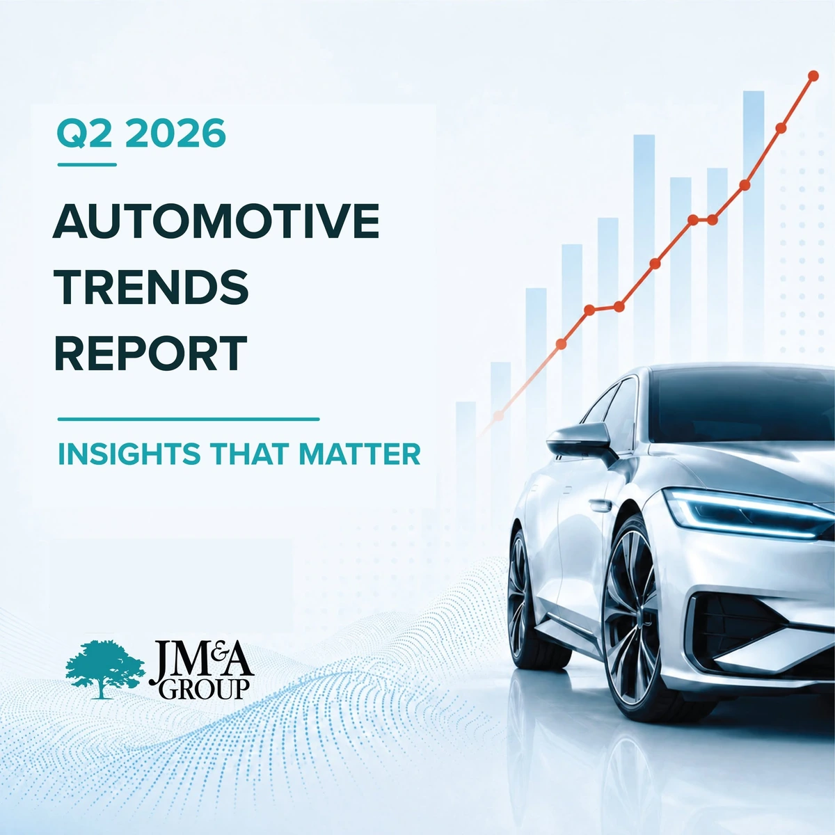
Connect to the dealer’s business.
This graphic connects the report to the business its audience knows. I used automotive imagery as a familiar entry point, then linked it to the performance insights dealers can explore inside. The aim was to make JM&A’s research feel relevant to their daily work and invite them to consider how broader industry trends relate to their own dealership.
05 / Data visualization
Make the findings
easier to use.
The charts needed to help dealers understand what the findings meant for their business. I organized each graphic around the trend, the key result and the accompanying takeaway so readers could move from comparison to interpretation. A consistent reading structure supports JM&A’s effort to make its research a useful quarterly reference for dealership teams.
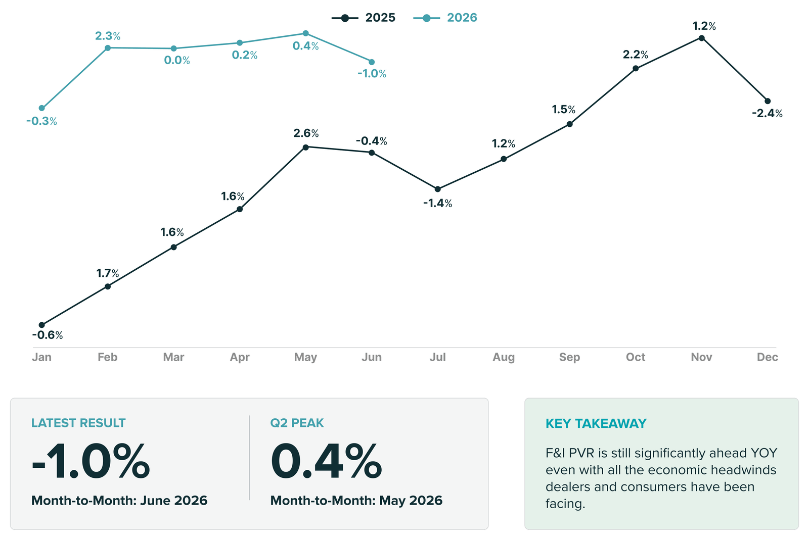
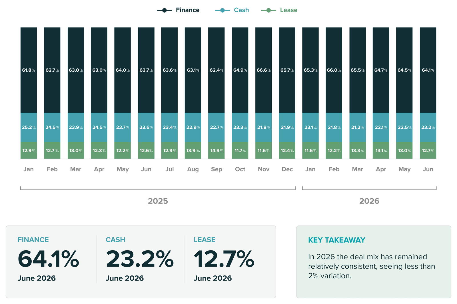
Published report graphics. Data and analysis: JM&A Group.
06 / Live application
The published campaign.
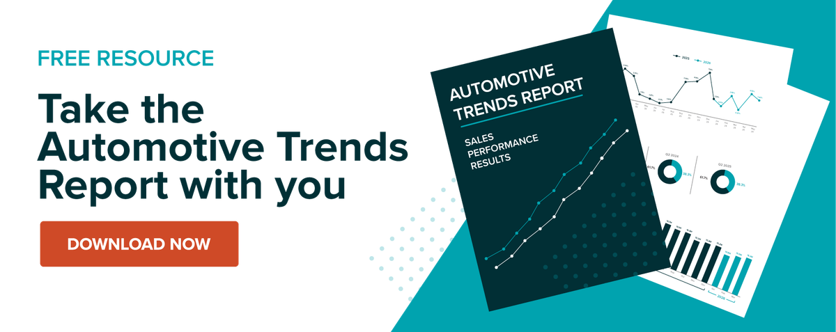
The web assets support the next steps after someone encounters the campaign. I designed the hero to introduce the report alongside the page’s explanation, and the download artwork to make the resource and next action clear. Carrying the campaign identity through both gives JM&A a consistent path from initial interest to report readership.
View published report (opens in a new tab)
07 / Reflection
Evolving a system
with intention.
Working within JM&A’s identity taught me to look for change in relationships: the balance of type and image, the prominence of data, and the way a motif carries from one format to another. Keeping the recognizable elements consistent gave me room to explore the composition around them.
Feedback from the marketing team also helped me connect visual choices to the audience and business purpose of each asset. A social graphic needs an immediate message; a report chart needs a clear reading order. Moving between them reinforced the value of establishing reusable templates and visual rules early, then adapting those rules with care. The result was a stronger understanding of how to refresh a campaign while preserving the identity that makes it recognizable.
New room to evolve. Still unmistakably JM&A.
